In this article, you’ll learn how to animate CSS box shadows without reducing browser performance.
In CSS, the box-shadow property is used to add shadows to web elements, and these shadows can be animated. However, shadow animations can affect the performance of the browser, causing lagging when rendering the page.
This guide is intended for frontend developers with a working knowledge of HTML, and CSS animation.
Why This Matters
A web page has to have a very short load time, ideally under five seconds. Research indicates speedy page loading gives a huge boost to conversion rates. Further research indicates that 70% of users say a website’s speed impacts their willingness to buy from an online store. Basically, fast sites equal happy users.
Before we go further, here’s a demo of how box-shadow animations can function on a web page. You can scroll through and interact with the web elements.
See the Pen
Web elements with shadow animation by SitePoint (@SitePoint)
on CodePen.
Three Main CSS Box Shadow Animation Events
Because of what’s happening behind the scenes, CSS box-shadow animation can be resource heavy. There are three main processes, or events, that are triggered during box shadow animation (or any form of animation, for that matter). These events are painting, layout, and compositing.
-
Painting. In painting, the browser fills in the pixels with color, and
box-shadowis one of the CSS properties that triggers this event. Basically, it creates a new shadow at every frame of the animation. According to Mozilla, the ideal CSS animation should run at 60fps. -
Layout. Some animations change the structure of a page, which can lead to many style recalculations. A good example would be a sidebar pushing other elements out of the way when expanding. The CSS properties that cause this include
padding,margin,border.Simply put, if the animated property affects other elements, it will change the layout of the page, causing recalculations — which uses a lot of system resources.
-
Compositing. In compositing, only parts of the page change. CSS properties like
opacityandtransformaffect just the element they’re applied to. This will mean fewer style recalculations, and smoother animations. Compositing is the least tasking process out of all three.
With your browser’s inspector tool, you can observe this process in real time. First, open up the inspector tool (Chrome is pictured below), and click on the three dots on the top right corner of the tab. Check More tools and select Rendering.
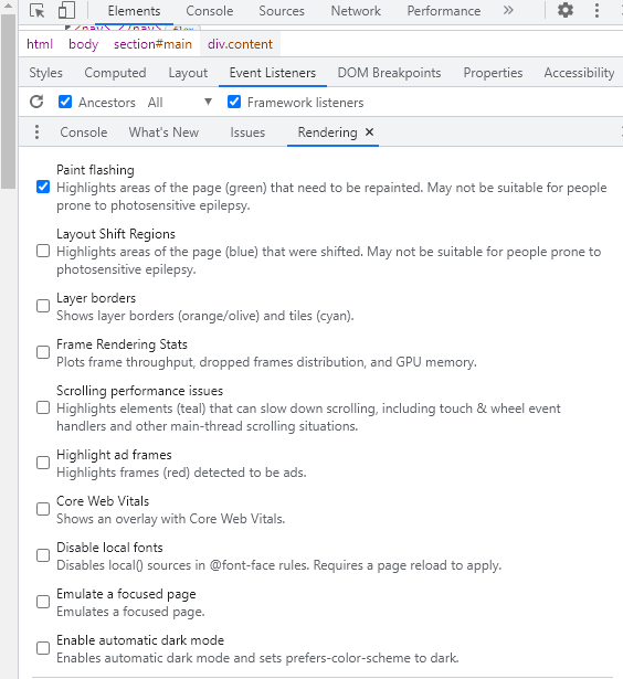
For this example, Paint flashing is selected. Every time there’s a painting event, the screen will flash green:
- The navbar:
![When you refresh the navbar flashes green]()
- The text cards:
![The same story with the text cards…]()
- The nav links:
![…and nav links]()
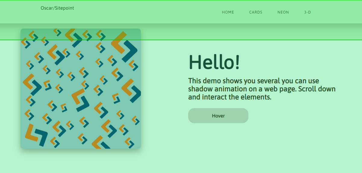
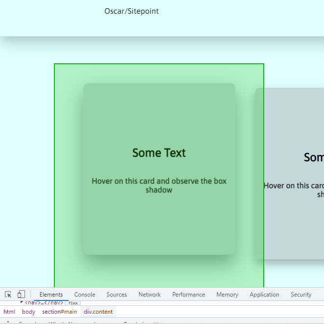
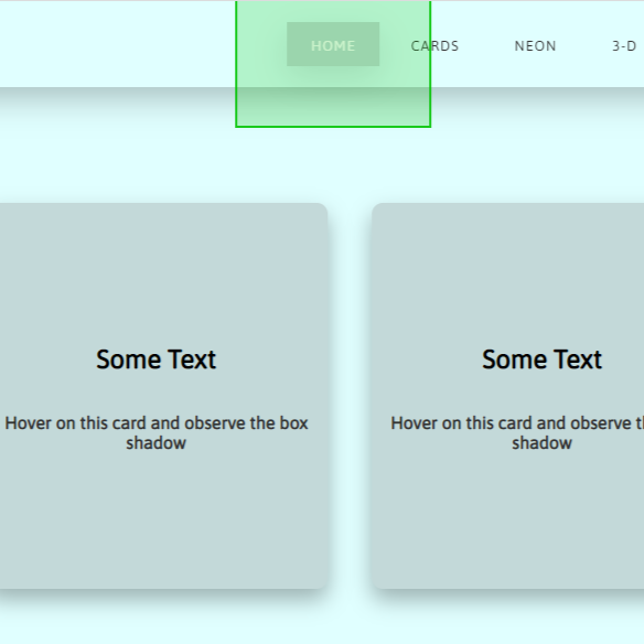
You’ll find that every element with a shadow flashes green when you hover over it, or when you refresh the page. You can also do the same experiment with layout: just uncheck Paint flashing and select Layout Shift Regions.
Please note that paint flashing may not work in CodePen demos, so you’ll want to try this with a live preview from a text editor. The video below shows what you should see.
[video mp4="https://uploads.sitepoint.com/wp-content/uploads/2022/10/1665465906paint-flashing.mp4"][/video]
The goal is to minimize painting and layout changes, because they use more system resources.
Checking Performance
As a developer, you may not have any issue running shadow animations because you have a fast computer. But you have to consider users with slower PCs and unreliable internet connections. Just because it looks good on your computer doesn’t mean it’s the same everywhere else.
A box-shadow has four values and a color. These four values are the shadow’s horizontal position (x-offset), vertical position (y-offset), spread, and blur radius respectively. A typical shadow animation will involve a change in one or more of these values:
box-shadow: <x-offset> <y-offset> <spread> <blur> <color>;
Let’s create a simple box-shadow animation, starting with some HTML:
<body>
  <div class="box"></div>
</body>
And here's some CSS for the initial and the final shadow:
.box {
  box-shadow: 0px 5px 10px 0px rgba(0, 0, 0, 0.5);
  transition: transform ease 0.5s, box-shadow ease 0.5s;
}
.box:hover {
  transform: translateY(-5px);
  box-shadow: 0px 10px 20px 2px rgba(0, 0, 0, 0.25);
}
Here’s the result:
See the Pen
Animated box-shadow by SitePoint (@SitePoint)
on CodePen.
For the animation, we’re changing the values of the y-offset, blur and spread. We’re also going with a more transparent final shadow.
Now let’s take a look at what's going on behind the scenes as we run this 0.5s animation. On your browser, open up the developer tools by right clicking and selecting Inspect. Once the tools are open, head over to the Performance tab. You can record the shadow animation; just a few seconds is enough to see what’s happening.
The screenshot below shows what you’ll find from Chrome’s devtools.
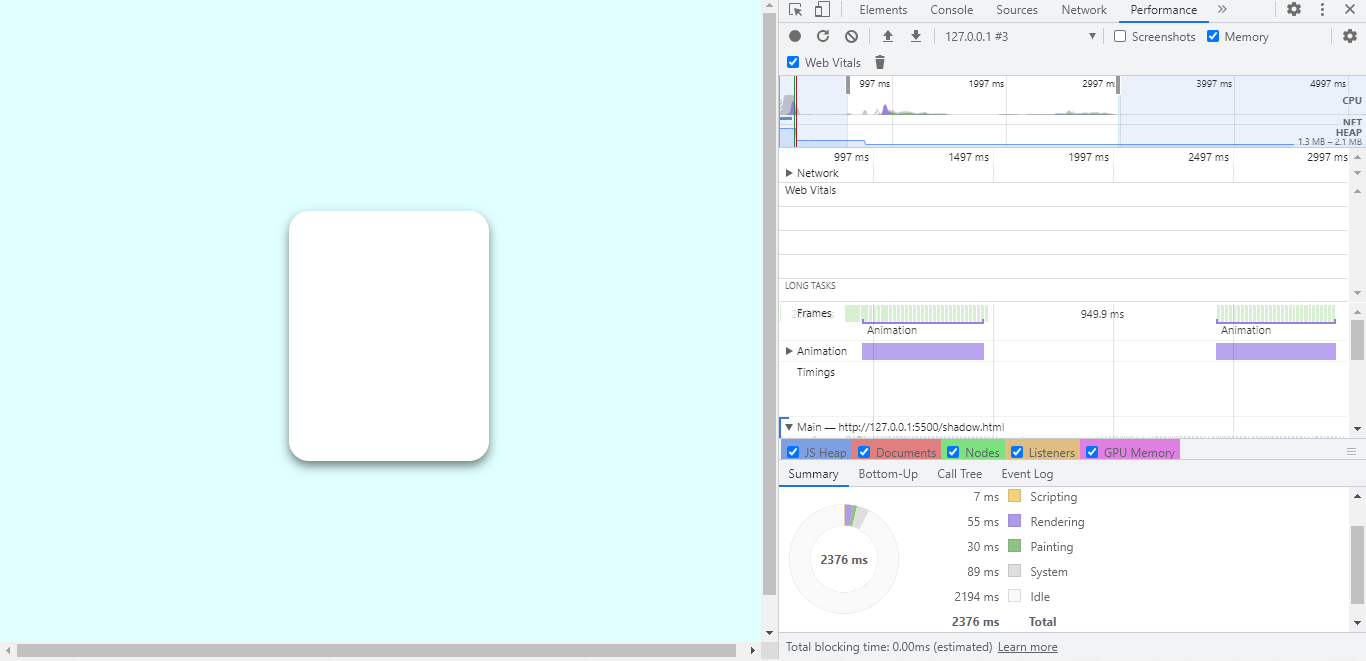
The shadow’s animation period, hover up and down, is highlighted at the top, and a breakdown of the processes that takes place is displayed at the bottom. The breakdown shows that scripting takes 7ms, rendering takes 55ms, and painting lasts for 30ms.
Now, those numbers seem okay, but what happens when the CPU is four times slower? You can throttle your CPU speed from the performance tab.
The following image shows what happens when you run the same animation with a slower CPU.
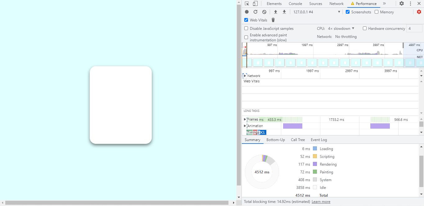
In this new process, loading takes 6ms. Scripting is up to 52ms, rendering has more than doubled to 117ms, and painting is now 72ms.
You can also throttle network speed, and make the CPU even slower. Shadow animations use a lot of system resources, and we’ll look to take away some of the load.
It’s important to note that the transform property plays a part in how the CPU performs. More on this later.
The post How to Animate CSS Box Shadows and Optimize Performance appeared first on SitePoint.